Yoheart
페이지 정보

본문
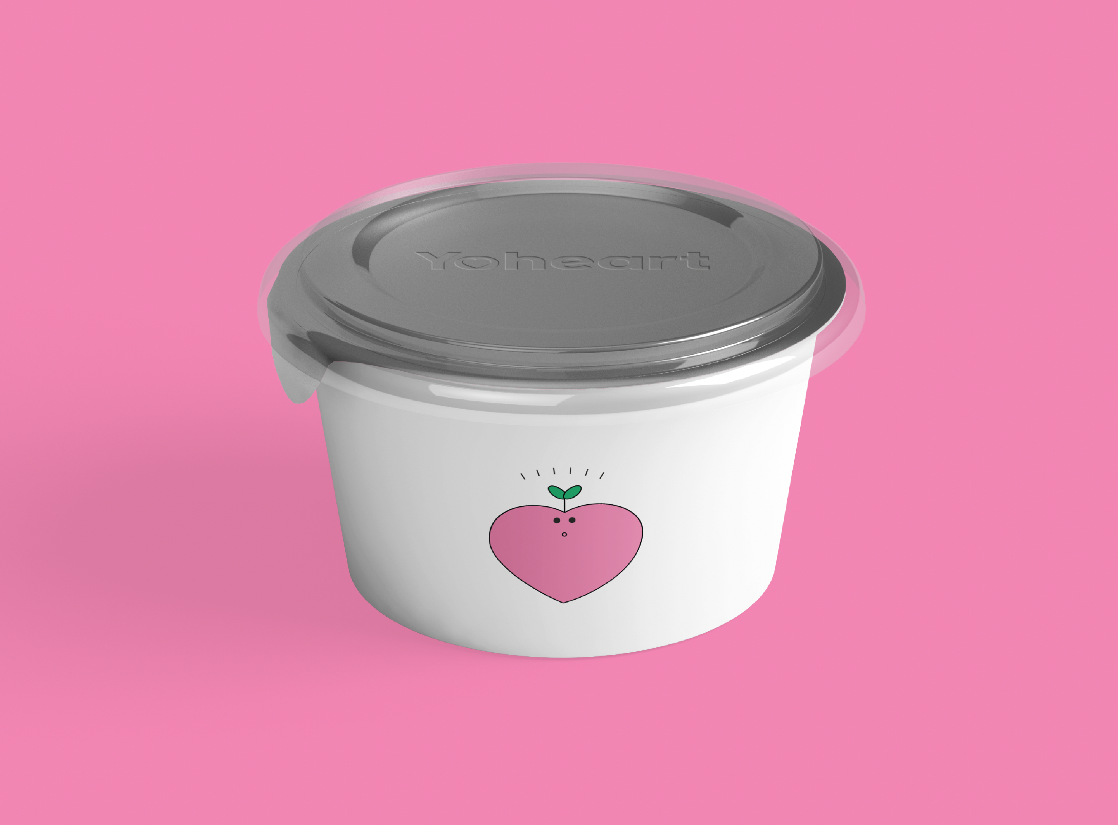
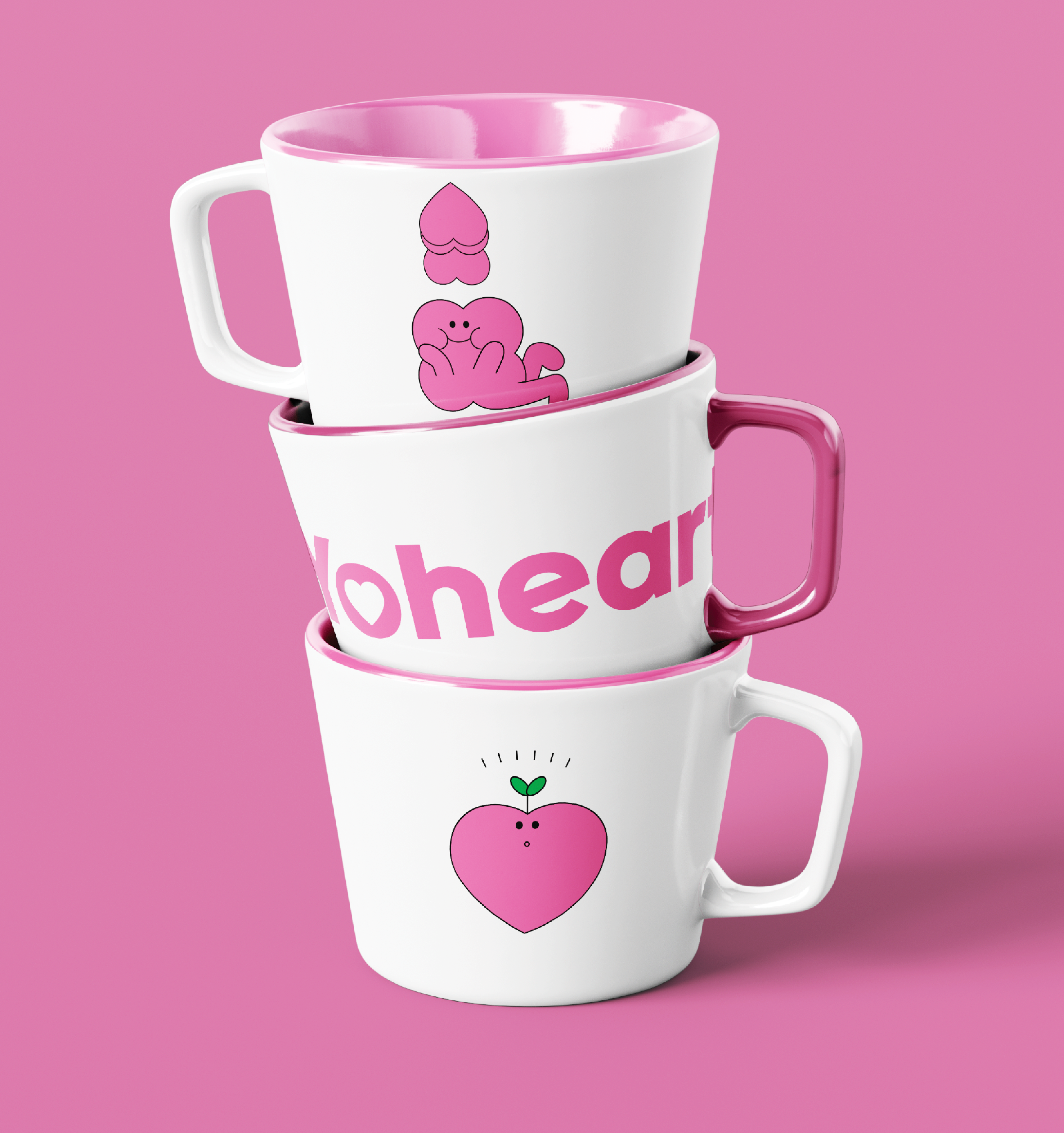
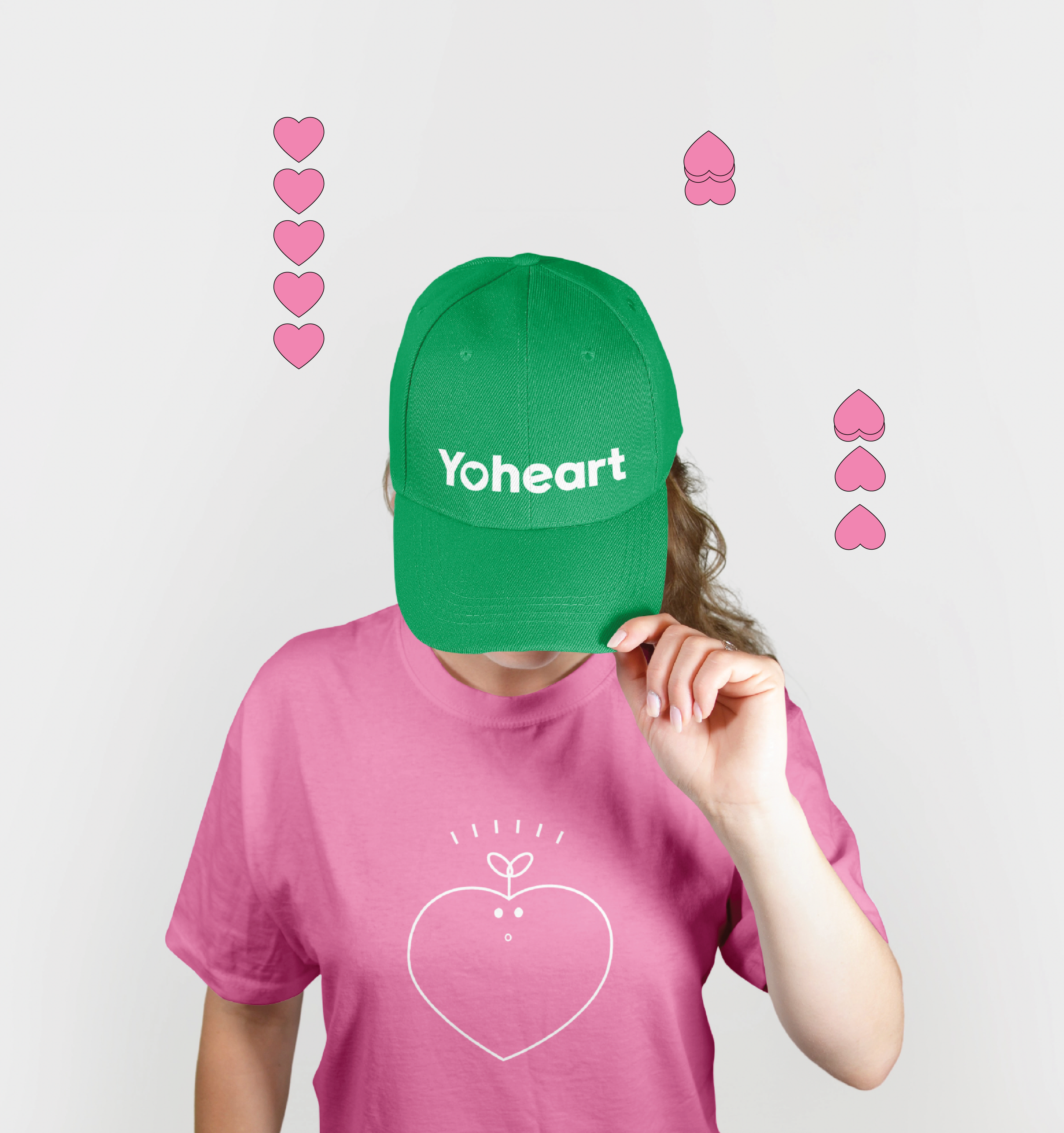
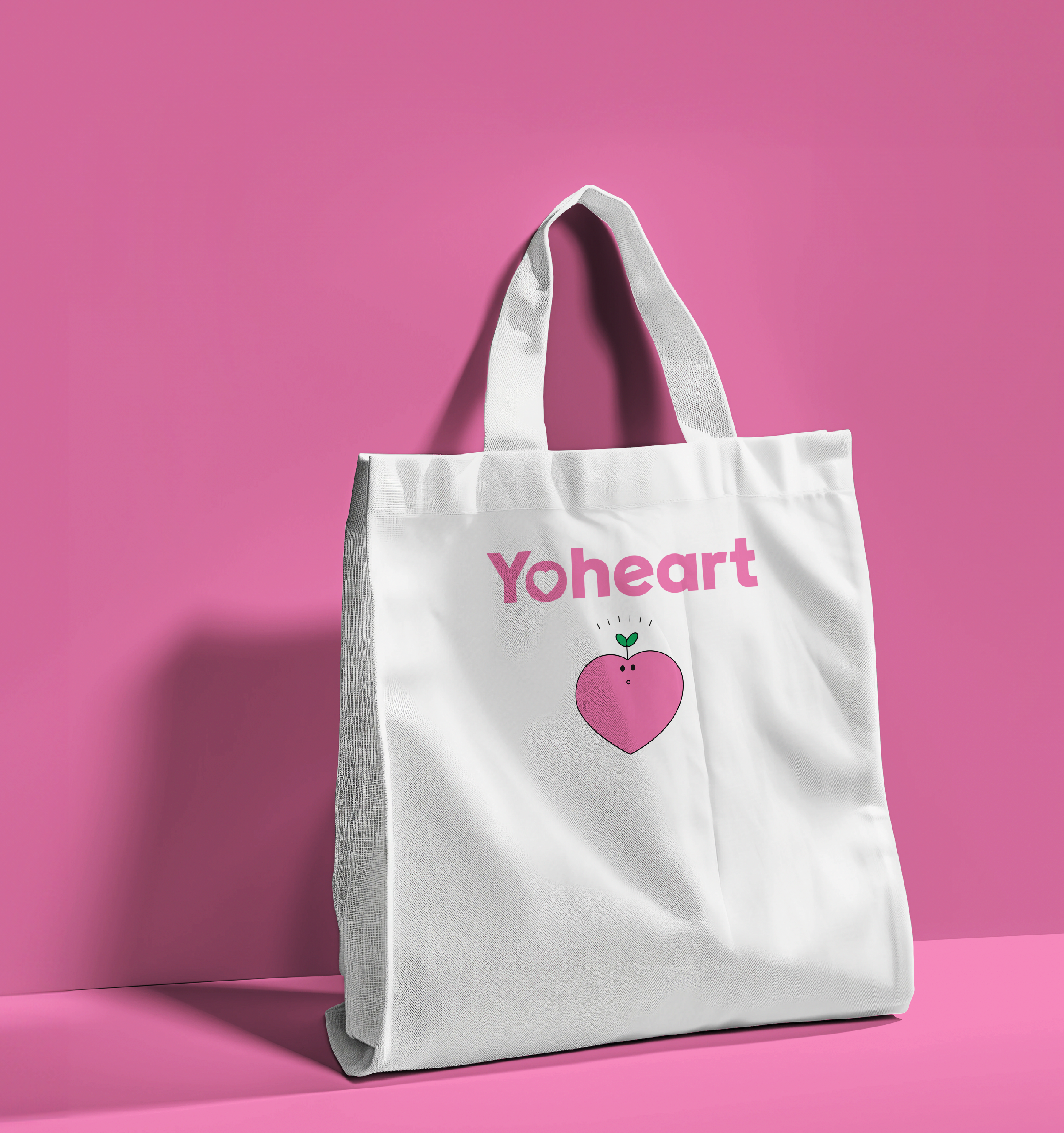
Yoheart B.I 를 디자인 하였습니다.
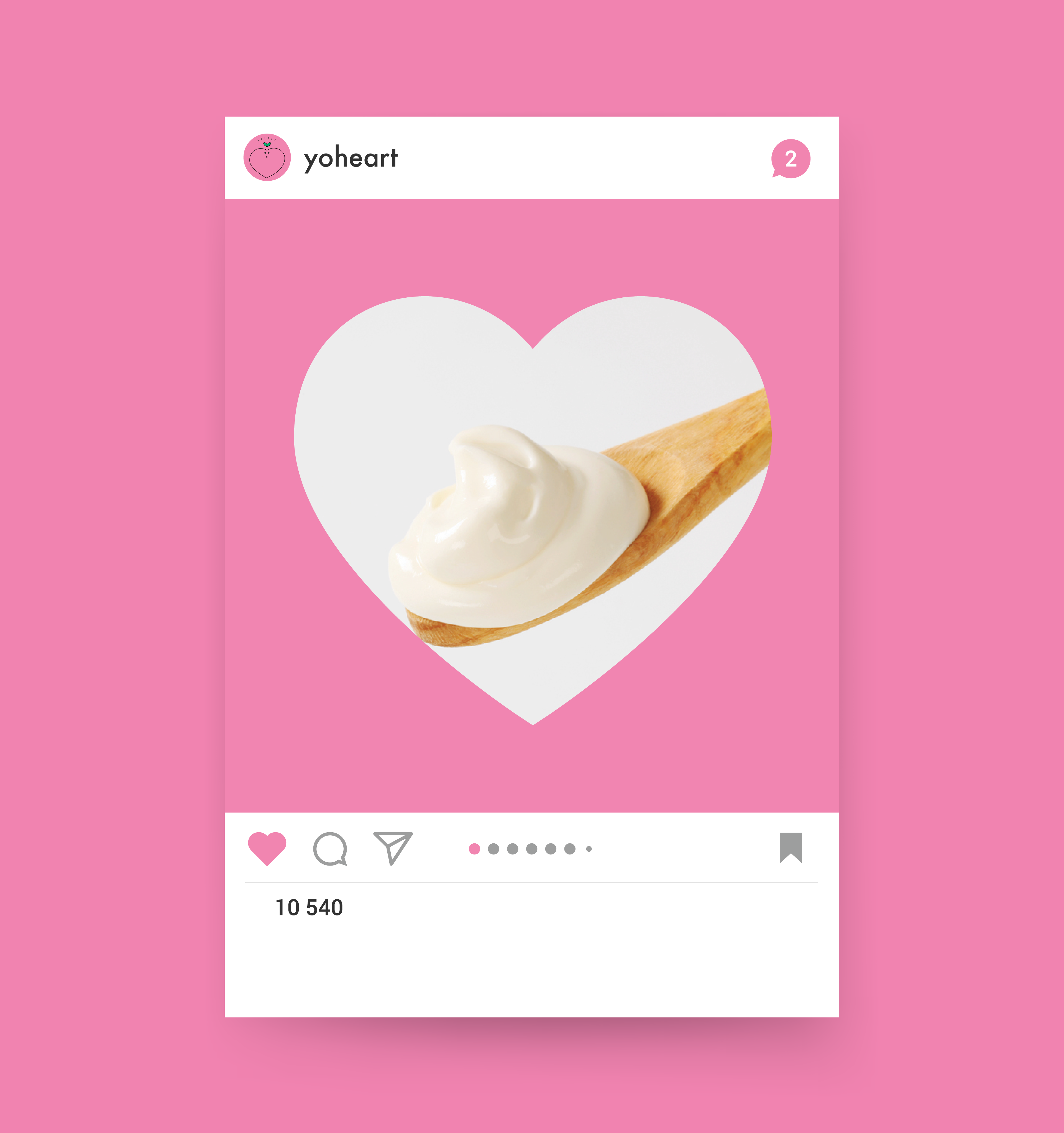
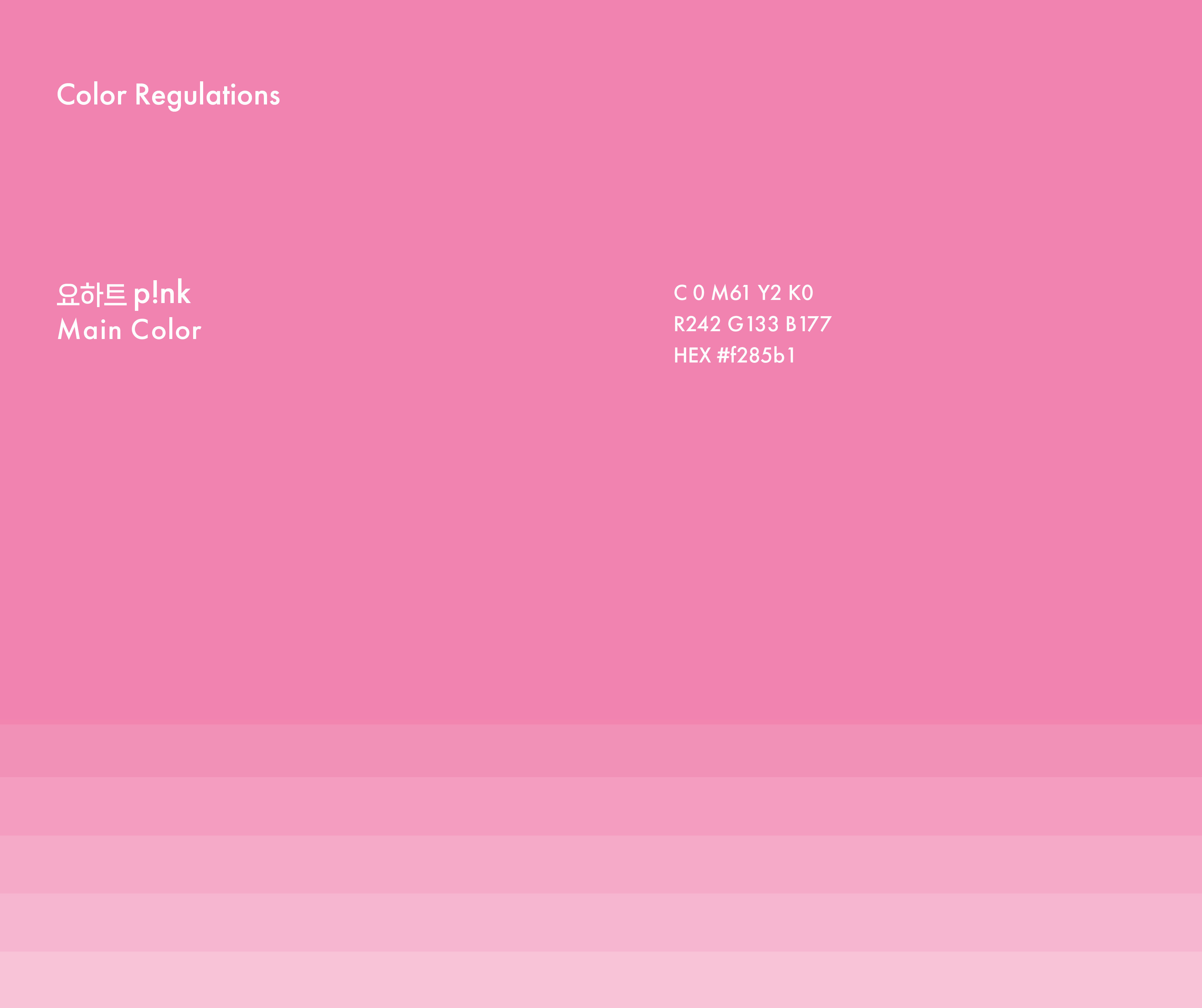
I designed the brand identity (B.I) for Yoheart, focusing on emphasizing the soft and healthy image of yogurt while conveying a bright and lovely feeling. The main symbol, a heart, visually connects the brand name with the product’s message. A bright pink color was used as the main color to create a lovable and friendly image. A simple and intuitive font was chosen to maintain a clean look, complementing photographs that highlight the smooth texture of the yogurt. Additionally, the character and symbol harmonize to enhance the product’s approachability and uniqueness. Through this design, the goal was to communicate the healthy and smooth qualities of yogurt and establish the brand as a warm and memorable presence for consumers.

- 이전글Just Pleasure F&B 25.02.20
- 다음글청주대학교 Cheongju University 25.02.20
댓글목록
등록된 댓글이 없습니다.